

Well, Hello!
(Fancy meeting you here).
It feels like forever since we've spoken. I hope that the rest of your Summer is treating you well. I for one can hardly believe that it's almost over: school begins again in just a couple of weeks and I feel like it just ended (dramatic sigh.) Soooo, I've been trying to make the most of what we have left.
To that end, I finally, finally walked into the studio yesterday. I brushed away the cobwebs (ok not really. But they did have time) and sat down to just try something. These little vintage photo collages / assemblages are the result. Wanna see?

"Little Goody Two-Shoes"
(16 x 12 on watercolor paper and plywood)

Molding paste and acrylic through map stencils.
This vintage cabinet card is a favorite of mine.

Colorful bits of collage and a little pink wire.

"Pay Roll"
(9 x 5 on vintage pay roll card and plywood)

Vintage photo and playing card box
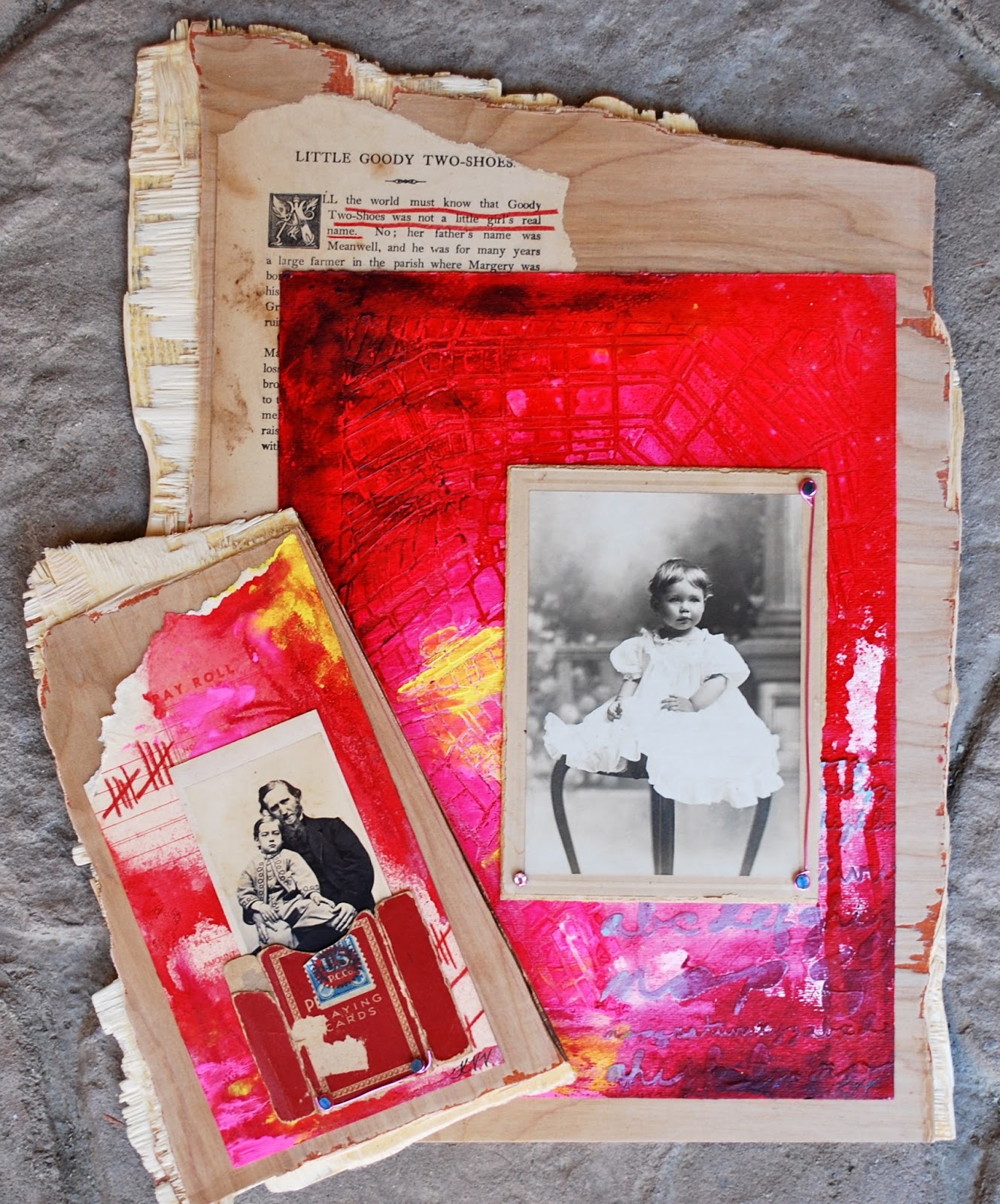
Together.
(I think I like a little color with my vintage ;)
I loved taking the time to play again; and it never hurts to get a little paint under my fingernails. . . .

I look forward to catching up with you,
Kristin xo
Lovely! The colors and the different elements are great!
ReplyDeleteYour "play" was very successful - giving me some ideas for the cabinet cards I have squirreled away. Love the colors
ReplyDeleteLovely work on the collages, love the pop of colour!
ReplyDeleteVery fun! Happy PPF!
ReplyDeleteRinda
They are gorgeous! Valerie
ReplyDeleteWow. Love your juicy colour and texture. Just stunning, and the substrates are very cool. I think last year's Summer holidays went by far too fast, they seem to get quicker as the children get older.
ReplyDeleteWow. Love your juicy colour and texture. Just stunning, and the substrates are very cool. I think last year's Summer holidays went by far too fast, they seem to get quicker as the children get older.
ReplyDeleteJust lovely.
ReplyDeleteHello Kristin,
ReplyDeleteSo happy to see your post today!! Glad you got some painting time, what awesome pieces these are. I love the backgrounds, wish we could feel them thru the computer screen, lol.
They both came out beautiful, love the b/w against the bright background.
Enjoy the last of your summer time!
These are just beautiful and I love the movement of the vibrant background colors against the neutral colors and static poses of the photos.
ReplyDeleteThese are great, Kristin! I love your backgrounds and the colors!
ReplyDeleteThat little girl is soooo cute, and i love the strong colours that you used ....
ReplyDeleteLoving the strong color with the neutral of the plywood and the vintage of the photos. Love the card box scrap on Pay Roll!
ReplyDeleteSo beautiful. The colors go so well with vintage elements --- an inspiration to me since I work with so much ivory and white when I work with old photos. I am still working on SOC in my art journal since I have some pages left; I'm using ice cream flavors like we did last summer and have discovered some new ones. I'll be posting them a little later.
ReplyDeleteHi Kristin, good to see you. Love your collages with those vintage photos, etc. Very nice job. Thanks.:)
ReplyDeletegloria
Beautiful! I love the colors you used!
ReplyDeleteSo good to see your beautiful art again!! I love the colors too!!
ReplyDeleteHugs Giggles
I love the bright happy colors with the vintage photos. The little girl is precious.
ReplyDeleteHi Kristen! It is SO WONDERFUL to see that you got a chance to play in your studio!! I absolutely LOVE the results - your work is amazing. And I am really in awe of the wonderful photos, too. I know what you mean about summer being almost over. Didn't it fly right by? My oldest goes back to college in 2 weeks and my youngest starts 5th grade in 3 weeks. Sigh! We are trying to enjoy each and every minute! Thank you so much for visiting my blog, too!
ReplyDeleteHappy PPF!! I love the bright collage paired with the b and w photos. A complete contrast of old and new but works so well. I think you have inspired me to dig out some old photos.
ReplyDeleteI like that you kept the cabinet card relatively vintage, but added all that color. I especially like the Pay Roll for the color and composition, and the little girl for her wired accent. Beautiful, both.
ReplyDeleteSo, so lovely! That juicy colour and all the lovely texture...yum! And it's so nice to see you back :)
ReplyDeleteIt is hard to believe that the Summer is at an end already!
ReplyDeleteGood that you are stepping back into the studio, though.....nothing like creating a little something to get back into the swing of things....
I love the bubble gum wrapper peeking through ;P
Hope to see you soon!
Cam
oh so wonderful to see you back Kristin!!!!!!!!!!!!!!!!! the summer is sure flying by!!! love all your latest pieces...you have a way with textures and colours!!!!
ReplyDeleteOh my gosh, I love the roughly broken plywood as the base! And what great contrasts with the bright color and texture against the plywood and the cabinet cards (that first one is so precious - I have trouble giving up the ones I really love, I admire you for using it!)
ReplyDeleteGood to see you again, loving the cabinet cards and the mixed substrate, Annette x
ReplyDeleteMissing SOC uh mm so I am happy of your posting :-)
ReplyDeleteI love the use of vintage. Blessings, Janet PPF
ReplyDeleteHi! I miss you! Hope you are enjoying summertime fun, and that your daughter's brand new school year is WONDERFUL!
ReplyDeletePaint under the fingernails is such a good look!
ReplyDeleteLove what you have done... especially the contrast with the bright colours. It really works well doesn't it?
Hope you have a lovely weekend
Karen x
Kristin,Just popped in to say hi from India. We had lovely time playing at SOC3. actually missing the fun now. And thank you so much for the lovely message you left on my blog at the end of week6.
ReplyDeletenagaonkarshilpa.blogspot.in
Ooo, I know right? Summer at first seems like it will never ever arrive, and then, swwwoooosshhh!, it's already gone.
ReplyDeleteI love the bright colours and adorable photo in your work here. It really makes the black and white of the photo stand out all the more. Brilliant and gorgeous! Nothing like a small project to get back into the swing of fall. Love and cheers! <3
I SO LOVE the vibrant color against the vintage imagery-well done!!! I recently posted another project I created around the SOC challenge this year...
ReplyDeletehttp://heartfullyinspired.blogspot.com/2013/08/indulge.html
Really cute. Love the colors. :)
ReplyDeleteI'm a big fan of cabinet cards...and I love how you have used those bright vibrant colours in your wonderful creations! x
ReplyDelete