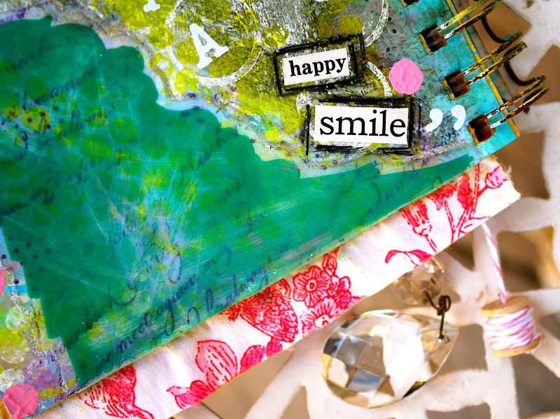
Showing posts with label metallic and glitter gel pens. Show all posts

Sunday, July 8, 2012

Week Five: Wild n' Reckless!

"E"
8 x 8 Canvas Flag

It's week five of The Summer of Color 2: Ice Cream Inspirations and our latest challenge is to create a piece of art based upon the cool and crazy colors found within Wild n' Reckless sherbet . . . .

I loved playing with these colors, and knew early on that I wanted to bring out the varied hues in the "flavor" through the strands of her hair. If she looks familiar, it may be because she was based upon this piece I recently did for Paint Party Friday. She was created using a combination of acrylics, Caran D'ache watercolor crayons, pencil and various metallic and gel pens. 

Can you beleive it? We're now on to our last color prompt, the bold and beautiful . . . . . okay, you can just look up . . . .

Ice Cream kisses,
Kristin xo

Sunday, July 1, 2012

Week Four: Strawberry Lemonade!

"M"
8 x 8 Canvas Flag

We're on to week four of The Summer of Color 2: Ice Cream Inspirations and our latest challenge is to create whatever our heart desires using the color palette found in Strawberry Lemonade . . . .

I have to admit, I was really looking forward to this one. The colors are feminine and sweet, and a nice departure from last week's more neutral tones. I wanted the "M's" to eventually face each other (Yes, it's gonna spell Summer. Well okay, you knew from the beginning ;), so I made the new girl facing the opposite direction of her "Baseball Nut" counterpart. I was inspired by a photo I saw on Pinterest to do a bathing cap sort of thing, and I love how the yellow ended up popping against the bright and pale pinks. In fact, I think I may have found my new favorite color combination!   

I can't believe how fast this is all going (only two color prompts left!) and I've had a blast so far. If you've considered joining in but have yet to do so, feel free to jump right in. We want you to come out and play too . . . .

Speaking of which, check out the next crazy color scheme. Now that's gonna be fun to see!

Ice Cream Kisses,
Kristin xo

Sunday, June 24, 2012

Week Three: Baseball Nut!

"M"
8 x 8 Canvas Flag

It's week three of The Summer of Color 2: Ice Cream Inspirations and our third prompt is to create something inspired by the colors found within the "Flavor," Baseball Nut. . . .

"Baseball Nut" is a new one to most of us - including me - and although I'm unfamiliar with the taste (can you believe I actually gave the ice cream cones away after photographing them - what was I thinking - I should have at least sampled them all first ;) I loved playing with the neutral colors of vanilla and cashew along with that bold pop of raspberry.

Once again, I used canvas material as my base and a mix of Caran D'ache watercolor crayons, acrylics and metallic and gel pens as accents. As a matter of fact, I used the same glittery gel pen here (Sakura Gelly Roll; a new favorite of mine) that I'm offering in this week's giveaway above.

Ready for more? Me too. Oooooh, look! The next color is so pretty . . . .

Ice Cream Kisses,
Kristin xo

Wednesday, May 30, 2012

A Boy & His Guitar!

"Cam's Guitar"
12 x 12 Gallery-wrapped Canvas


My little friend Camden turned 5 yesterday. He loves guitars (we may have a future Rock Star in our midst) so it was no surprise that his Birthday Party invitations featured them. Now, I have - for every year of his life - made a scrapbook for he and his sister, who were each born on the same day, seven years apart (I know, right) for their special presents. 

Remember this one?

From Camden's Birthday Book, 2010

But this year, I decided to go another route and create something for them both that spoke about them and their passions. I hope they're a hit . . . here's my attempt for Camden:

Drawn freehand from an image on his invitation,
using the colors of his room for inspiration

Acrylic, Caran D'ache watercolor, oil pastels and fine glitter

Gallery-wrapped sides covered in distressed wallet-sized photos
from last year's birthday party.
{Giving credit to the hubby for this idea}

A smudge of oil pastels completes the look

Whew! One down, one to go (er, complete) . . . finger's crossed, I'll have his sister's special gift to share with you for PPF . . . .

Until then,
Kristin xo

Wednesday, May 9, 2012

Mind. Body. Soul. (Art Journaling)


Believe it or not, I am almost done with the journal started for sweet Leslie's online course, Mind. Body. Soul. Good thing too, as the prompts ended about two weeks ago. (sigh). . . .

Below are shots of the last journal spread for Anxiously Engaged, followed by the first and last pages of the book:

"Oh the places we will go"
(Vertical spread)

Vintage music, vintage stamps, Stampington art papers (bike) and personal photo

Opening page /  Table of contents:

"Contents"

Featuring all of Leslie's prompts

Carefully selected papers hint at what's to come

Back / final page:

"Put on a happy smile"

Swarovski crystals, rub-ons and paint chip


There you have it. Only one thing left to complete: the cover! Oh, and the story behind the book as a whole. On a personal note, when I started the course, I had no idea what or where I would be when I ended it. I don't mean to sound cryptic, I will finish the cover, put it all back together, and share the story in it's entirety in my next post for Paint Party Friday

See you then,
Kristin xo

{Looking for The Summer of Color? Get the whole scoop here.}

Friday, April 13, 2012

Mind. Body. Soul. (Art Journaling)

Journal entries for Mind. Body. Soul.

After Spring break for the petite first grader, hosting Easter for a crowd, and then having company for the last week, I'm happy to finally get back to the studio (er, "guest room") and get some paint under my fingernails. I worked on a couple of journal pages (one of which I attempted to start during the hiatus) and wanted to share the results with you here.

The following pages are inspired by sweet Leslie's Art Journaling e-course, Mind. Body. Soul, and are based upon the word of the week (4), "Overcome:" 

"O. ver. come"

"To get over, surmount difficulty . . ."
(like getting a photo of this in the rain!)

To create this background, a base of blue Caran D'ache watercolor crayons was covered in a mixture of crackle paste and black ink before being dried and then sanded down. Additional layers of blue crackle paint and black marker complete the base for a ripped, distressed and highlighted (with glitter gel pen ;) dictionary definition of the word, Overcome

"Who'll carry the torch?"

Mother Goose images and text covered in Distress Ink and acrylic

Stamped, painted and highlighted Baby Buggy 
with vintage milk cap & Swarovski crystal wheels

Decorative papers & Stickles glitter

Did you know that Christy Tomlinson had a line of scrapbook and papers and embellishments!? Okay, you probably did, but I was thrilled to find a gorgeous, colorful collection of double-sided papers that would make anyone squeal. I found them on a recent trip to San Diego, CA, in the most adorable paper boutique called Paper Tales. The new line of papers can be seen on their beautiful Paper Tales blog.

I started this one with a base of orange watercolor crayons which was layered with yellow acrylic, various stamps and a vintage Mother Goose image and nursery rhyme. The quote reads, "To overcome difficulties is to experience the full delight of existence." (Arthur Schopenhauer).

Thank you for looking! Check out Mind. Body. Soul. for week 5's journal word, Renew. . .  

Kristin xo

Monday, June 20, 2011

The Summer of Color - GREEN

"Pink with Envy"
8 x 10 Watercolor Journal Page

Wow . . .
What an incredible Blue week! I'm thrilled with the response we had with our first color prompt and am throughly enjoying the connection and community we're building here. Thank you for your time, enthusiasm and for sharing this colorful journey with me. . .

A little bit about Linking, Commenting & Giveaways:
Thank you for linking your color-specific artwork in the widget below. In order to qualify for the weekly giveaway, you must also leave a comment in the comment section directly below the current post. Starting this week, if you participate in the bonus challenge, you will be able to enter your name twice. The best way for me to get an accurate count for the Random Number Generator (and to save you from having to link more than once) is to take your names from the comment section. With that in mind (and although it goes against my very nature to do it ;), I have deleted any duplicate or additional comments from last week's blue pool in order to get an accurate count. As of this week, (A) please link your work in the widget below so that others can find you, (B) leave one comment if you created a Green piece and (C) leave two comments if you completed the bonus challenge. 

Anything else?
If you just found us, please feel free to join in the fun! Don't worry if you missed a week, you can pop in anytime. Also, there's an amazing community of artists gathering on the The Summer of Color Facebook page and in our Flickr pool. Check it out . . .

So who won the Blue Giveaway?


Please email me your address and I'll get it right out to you . . .

Now, on to GREEN week . . .
This week's color challenge is Green. The Bonus! Challenge is to somehow incorporate the color Citron into your piece. Please remember to leave an additional comment should you complete both. I so look forward to seeing what you do! 

And what is this week's Giveaway?

An elegant floral picture frame with vintage sheet music, Liquitex acrylic paint in Brilliant Yellow Green, a set of two Moleskine ruled notebooks, Craft Smart polymer clay and a sprinkling of green, iridescent and clear Swarovski crystals and beads.


Okay. Please feel free to link your GREEN work here:
(Monday the 20th - Sunday the 26th)


And what is next week's color?

PINK!
"Pink is the navy blue of India"
-Diana Vreeland

Bonus!
Next week's Bonus! Challenge is to incorporate wax into your piece. Beeswax, candle wax, wax crayon . . . any kinda wax will do . . . Have Fun!

Kristin xo

Wednesday, February 9, 2011

The Grapes of Wrath

The Grapes of Wrath
Altered 5 x 7 canvas panels
"Conceiving"
"It was True"

I've had a hankering to do a piece on Steinbeck's The Grapes of Wrath for a while now. It was a memorable high school prerequisite for me - the story of the Joad family who were forced to travel great distances in order to make a better life for themselves in the midst of the great depression - and I've found myself referring to it's message of humanity and survival quite a lot in the last couple of years. I think it's concepts are as timeless today as they were when the American classic was first published in 1939. 

So I started by picking out a few quotes that really spoke to me. I found two that inspired me and based the 5 x 7 canvas panels that you see here around them. . . 

These were created by first adhering a page from the book (which contained the quote I wanted to use) with matte gel to the canvas panel. I wanted a worn, messy look, so I set the page slightly off center and then sealed it with more gel. When dry, I used petroleum jelly on the bits I wanted to highlight and then covered the rest of the panel in a light wash of copper acrylic (to represent the Oklahoma "red country"). When that layer had dried, I wiped off the jelly to reveal the text I was after. Charcoal (both white and black) and sandpaper were then used to further distress the piece before stamping the sides with foliage and swirls meant to represent grape leaves. I then pulled out some period pieces, ephemera and photos in an effort to describe the passage. Final touches included "painting" the leaves with two colors of fine glitter and highlighting the vines with a gold gel pen.

"Conceiving" features a piece of broken tape measure, chunks of mica and wire, a photograph from the 1930's and the following quote: "For man, unlike any other thing organic or inorganic in the universe, grows beyond his work, walks up the stairs of his concepts, emerges ahead of his accomplishments."

"It is True" incorporates some of the same elements in addition to a vintage photograph of a man (meant to represent the character who spoke), a piece of a vintage receipt book and several vintage glass tubes tied with wire. The quote here reads: "Maybe,' I figgered, 'maybe it's all men an' all women we love; maybe that's the Holy Sperit - the human sperit - the whole shebang. Maybe all men got one big soul ever'body's a part of."

Thanks for looking! I'm now on to painting again - I need to get my "girlie" fix . . . 

Kristin xo

Sunday, January 30, 2011

MMM: Size Matters

"The World on a String"
24 x 30 Gallery-wrapped Canvas
Detail of dress and twine
Detail of Texture Paste on world & hill

Finished! And what a labor of love it was . . . This large 24 x 30 gallery-wrapped canvas will be presented as a gift to a brand-new baby tomorrow, and I'm hoping that it will live above her crib. I've been helping my friend decorate her nursery (it was started a couple of months ago without knowing the gender) and now that the beautiful baby has arrived, I'm hoping to pump up the girlie factor by adding some fun colors and feminine touches such as those in this piece, "The World on a String". . . 

Of course I'll show you the decorated nursery when it's complete (hint: it has bright white walls and a royal blue ceiling) but in the meantime, this painting will serve as my entry for this month's Mixed Media Monday prompt, Size Matters

In other blogging news, The House of Art launched today (I promised I'd tell you!) and my first video and article on "What is an Artist" is now online. Check it out when you can, I know that you'll love it there. . . 

Kristin xo

Sunday, November 21, 2010

Willowing & Friends!

"Invitation Angel"
12 x 18 cold press watercolor paper
Full page
Detail of "Trust"

The final assignment for Willowing's Art, Heart & Healing is to create an "Invitation Angel" or figure  intended to represent that which we may be lacking in our daily lives . . .

And this was very interesting for me. I started out week 4's lesson intending to soak up as much knowledge as I could while creating a pretty picture. What I didn't expect was how much the piece would really "speak" to me . . . . Let me explain: as many of you know, we are eager to adopt again and have been trying for years now to find another adoptive situation. To be honest, it has been a long, painful wait. We were connected with Kendra's Birth Mother (her "Tummy Mummy") relatively quickly just over 5 years ago and I guess we expected or hoped that it would come as easily the second time around. But that has not been the case. We waited a couple years after K was born because she was in and out of the hospital and needed our full attention. Then came the recession and an expensive adoption was not possible for us. So, I started finding other avenues to spread the word in hopes to find a Birth Mother on our own. . . Now we are ready financially and otherwise and, well . . . are still waiting. We just this month went through our county to adopt in that way (usually faster than a traditional adoption agency) and were devastated to learn that we would not even be able to begin that process until the middle of next year. So here we sit, ready and waiting . . . 

Which brings me to the piece above. What I am in need of (and a word that I have clung to in the last year) is Trust. I know that this is all happening for a reason and I know that we will adopt again. But I have to Trust that it will happen in the right time, and not just the time that I think is right. . . 

And as I worked on this little one in the last two days, I found myself really connected to her. She was given eyes the color of my husband's and tiny freckles which to me indicates youth. I choose to color her hair both blue and pink and give her the suggestion of a belly . . . and all of this was done with my knowledge but without really thinking about it. . . and when I looked at her this morning with fresh eyes, I noticed that the stripy hair on the left represented Kendra, my beautiful little tomboy. It will be really interesting to look back at this piece later in life and see if there are more hidden clues that will only become evident when our next baby is home. . . 

I also want to take this opportunity to thank Willowing for all of her efforts in bringing this beautiful community together. It has been an amazing experience, one which I hope you will consider doing yourself, if you have not joined already. She will be leaving the course up indefinitely so that everyone can benefit from the healing exercises she has so generously offered. 

Kristin xo